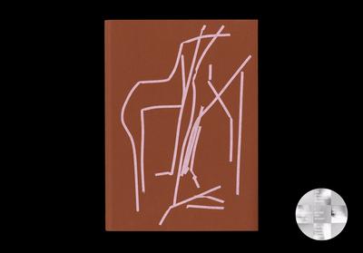
⭐ Most Beautiful Swiss Books 2020
⭐ Best Dutch Books 2020 (student jury)
–
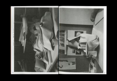
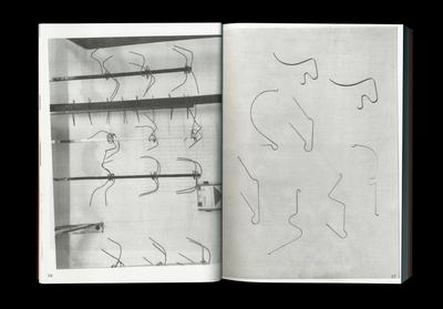
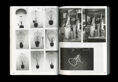
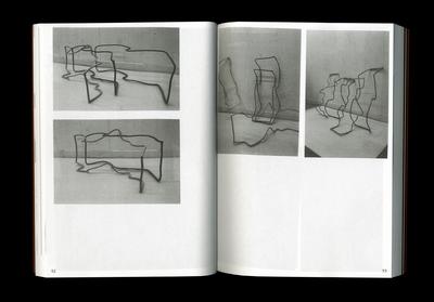
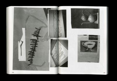
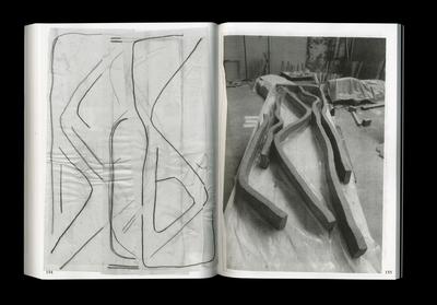
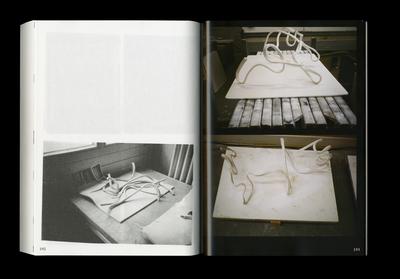
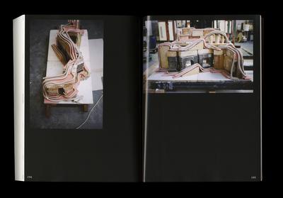
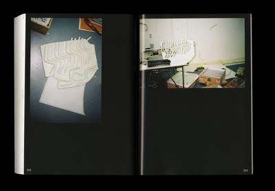
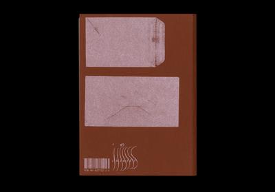
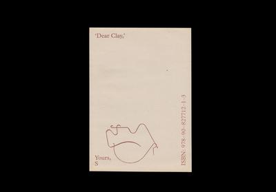
‘Dear Clay,’ gathers a selection of spreads extracted from Stéphanie Baechler’s meticulous sketchbooks displayed in chronological order (2013 – 2019), as well as 35 mm photographs documenting her working process. Providing an intimate insight into her artistic practice, it reveals what facilitates the work from its conception to its making, transportation, and installation. Rather than presenting it as a final staged object, we see the work as something unpolished, unfinished, in flux. Activating this archive of images allows to search for what creates the identity of a work behind the surface of the conventional gallery presentation.
![]()
Dear S,
I have been thinking about my last visit to your studio lately. The one in which you revealed the collection of black sketchbooks you had been keeping for the past decade. I have always been pretty bad at keeping sketchbooks myself despite my love for drawing. This is maybe why I got attracted to those spreads you carefully laid out. While turning the pages, I realised that those books became a tool for you to place past, present and future into a constant dialogue so that each could largely influence on the other. Thinking of time as a linear concept, it seemed like you were interested in the turns, loops, and zigzags rather than the unbent passing of it. The shorthand like pencil scribbles, the snaky clay shapes, the entanglement of threads or the exacerbated curves of a mannequin’s body all became the sinuous signs of a serpentine line that kept on asserting its presence around the small space of your studio.
‘Have you ever heard of William Hogarth’s obsession with the Line of Beauty?’ I asked you, simultaneously googling one of the illustrations that I remembered was accompanying the essay and pointing my phone to illuminate your face in the darkish room. ‘I’m not a hundred percent sure anymore, but I think that similarly to the golden ratio, the S-shaped line of Hogarth was some kind of explanation or tool justifying pleasing aesthetic proportions in art, architecture, nature at the time. In contrast to the dead straight line, the S was full of life and worked as a visual trigger attracting the viewer’s eye magically. I always found that a little stupid and beautiful at the same time. This idea that a fictional line of varying curvature could explain someone’s attraction towards certain things rather than others.’
A few years ago, I had the thought to deconstruct Botticelli’s Venus into a series of lines à la Hogarth as a rather trivial joke on his Line of Beauty. With those as the pieces of a puzzle, I assembled the character’s body together again. I thought you might find the result funny so I attached the cartoony figure to this letter (looking back, I wonder why she is not standing on a larger than life open scallop, like in the original painting). At a later stage, I finally turned the pubic hair-like series of lines into a bunch of unreadable characters for a typeface. Typesetting with Venus allowed a perpetual shift between writing with an image and drawing with language. Text like water, water like text.
‘What kind of alphabet is that?’, I asked you while pointing on a random page at a series of small signs curved and bent at various angles. ‘Those are complications’, you responded, referring to the term that is used in horology to describe whatever extra feature a watch can perform on top of its basic function, providing time. ‘Those are no letters, they are tiny springs used in the making of complications.’ Amazed by the notion of the complication – or maybe rather by the directness of the word itself – I started to think of it in relation to other things. Whatever detail that does not concern the main plot of a story is a complication, whatever hot sauce I add on a taco is a complication, whatever bookmark I add to a publication is a complication.
So I wanted to ask, should we try to make a book about some kind of line, not without including a couple complications?
xr